:Visual storyteller building brands that perform, not just pose. Das for short.
Brand positioning · Performance creative · Art direction · Web & CRO design
Scroll
Clients I've worked with
casestudy 01:
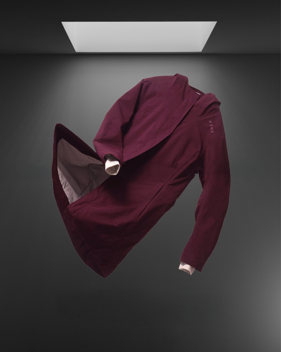
Rebranding that led to 290% YoY sales growth
Sales growth, year over year +290%
November sales $100K→$1M
Revenue from new customers +86%
Rebranding is not just about looking good. It's about refining the language to reach the right audience.
Read the case →casestudy 02:
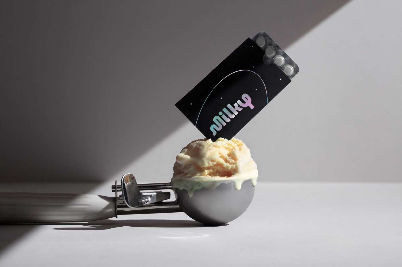
A creative engine built to scale
Sales growth, year over year +236%
Amazon, first six months $546K
ROAS (MER), year over year +39%
No rebrand, no new site. A year of testing where every angle came from something a customer had already said about the product.
Read the case →About
Creative strategy for the online ecosystem
I live and breathe the online space. Drawing on a decade of experience with diverse brands, I handle the complete digital lifecycle—bridging brand positioning, ads, and site experience from first click to checkout.
More about me →Off the clock
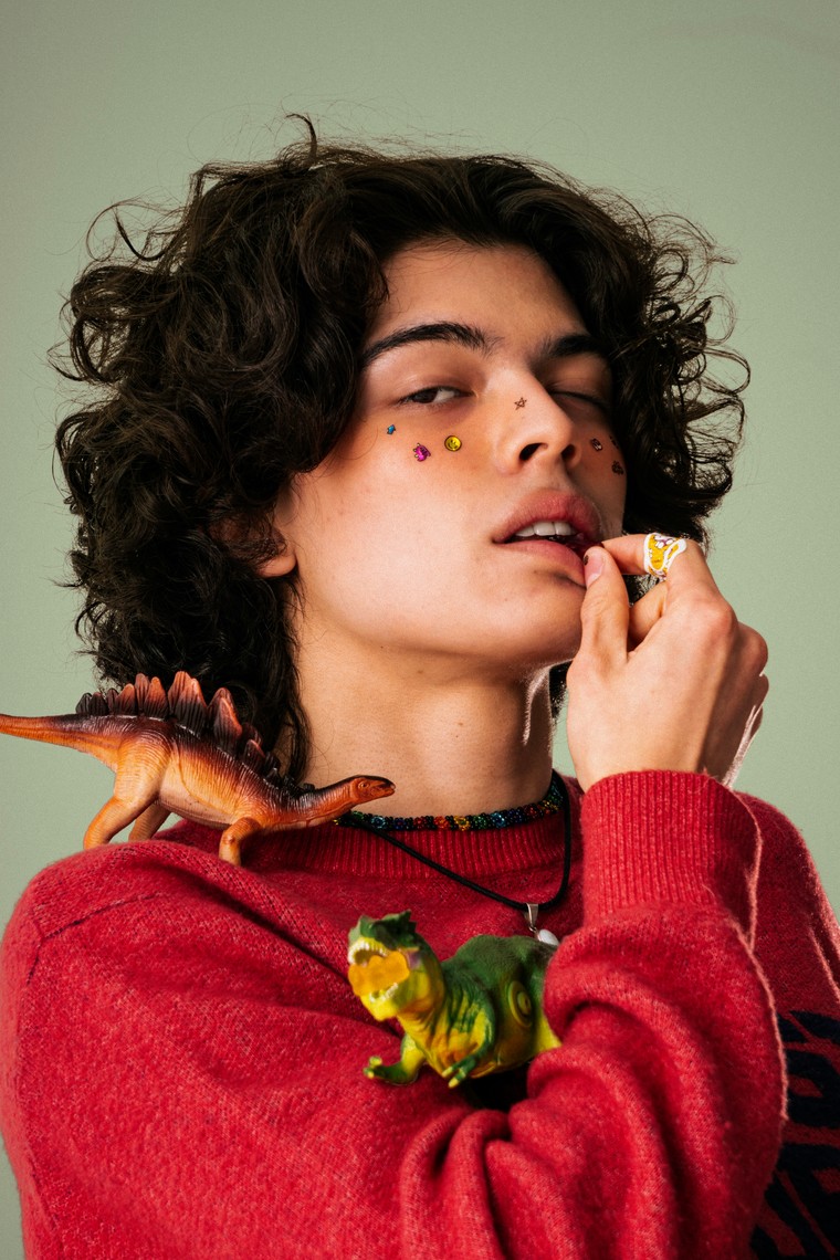
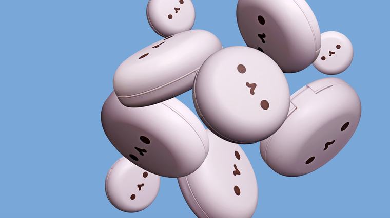
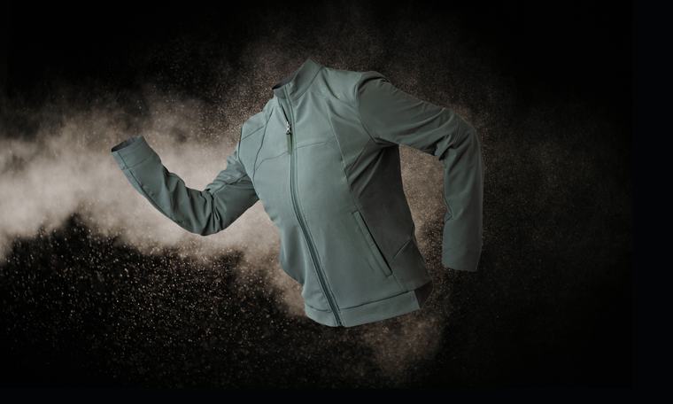
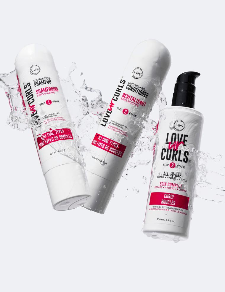
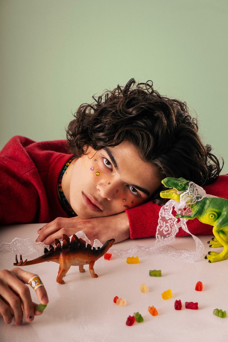
Sometimes I like to take photos
Toolkit
My weapons of choice
- Design
- Photoshop · Illustrator · Figma
- Video
- CapCut · Premiere Pro
- Generative
- Higgsfield — image and video
- AI
- Claude — including Claude Code · Gemini
- Front-end
- HTML · CSS
- Storefront
- Shopify — themes and page structure
- Planning
- Monday.com · Motion
- Handoff
- Canva — templates the team runs without me
About
About Me
 Portrait
How much of the story do you want?
I learn by doing. I started out wearing every hat at a tech nonprofit, but when my personal YouTube hit 100k, producing ads made me realize I prefer being behind the camera. That realization led me in-house to a haircare brand. There, seeing my designs translate into hard revenue felt like watching a real-time scoreboard. Hooked on performance data, I moved to an agency to lead creative for brands like Omie, Kappa USA, AeroPress, Dyper, and OROS. Today, I use all these pivots to see the full digital picture.
If you look at my background, you’ll notice I like to learn by doing. Fresh out of an Advertising Design program, I joined a tech nonprofit where I did a bit of everything: web design, Android UI, video production, and pitch decks.
Around the same time, a beauty YouTube channel I started for fun hit 100k subscribers. As I started collaborating with brands on paid ads, I realized something unexpected: I actually loved being behind the camera—planning and producing the content—way more than being in front of it. That realization pulled me into the beauty industry, landing me an in-house role at a haircare brand.
There, I shot products, designed ads, and learned exactly how a Shopify front-end comes together by building one side-by-side with a single developer. But the biggest shift happened while working directly with the Director of Marketing. Seeing the creative work I made instantly translate into hard numbers and revenue felt like watching a real-time scoreboard. It was fascinating, and it made me want to truly understand the performance side of design.
Chasing that curiosity led me to a marketing agency. Leading creative for brands like Omie, Kappa USA, AeroPress, Dyper, and OROS taught me the art of shape-shifting—figuring out how to step into a new brand’s world, speak their language, and back up the creative with actual data.
Today, all of these pivots give me a rare, full-picture view of the digital landscape. I know exactly how the pieces fit together, because I’ve built them all myself.
Where I've been
- 2024 – 2026
- Inflection Growth — Creative Strategist / Senior Designer Creative lead on DTC accounts, OROS and MILKY among them
- 2023 – 2024
- Freelance — Graphic Designer Identity, print and social commissions
- 2019 – 2023
- LUS Brands — Senior Designer Multimedia Designer, 2019 – 2020 · Toronto, in-house
- 2017 – 2019
- Freelance — Graphic Designer Toronto
- 2014 – 2017
- The Rumie Initiative — Web & Android UI Designer Education Designer, 2014 – 2016 · Toronto, nonprofit
- 2009 – 2012
- George Brown College — Advertising Design Toronto
Toolkit
My weapons of choice
- Design
- Photoshop · Illustrator · Figma
- Video
- CapCut · Premiere Pro
- Generative
- Higgsfield — image and video
- AI
- Claude — including Claude Code · Gemini
- Front-end
- HTML · CSS
- Storefront
- Shopify — themes and page structure
- Planning
- Monday.com · Motion
- Handoff
- Canva — templates the team runs without me
Let's build something great
If you are looking to elevate your brand's true value and need a strategic creative partner, let's connect.
Get in Touch →casestudy 01:
Rebranding that led to 290% YoY sales growth
What I was in charge of
- Brand repositioning
- Concept, positioning, messaging framework
- Front-end design
- Theme replacement, page structure, PDP rebuild
- Art direction
- Moodboards, model selection, final selects
- Performance creative
- Nearly every ad on the account, static and video
- Design system and templates
- Creator direction
- Selection, briefs, approvals
What the repositioning was worth
Sales growth, year over year
+290%
November sales, year over year
$100K → $1M
Revenue from new customers
+86%
Buyers who had never bought before
Agency account numbers — my scope is listed above.
01 · Brand positioning
Bridging the gap: Technology meets everyday life.
The previous branding made OROS approachable but lost the technological edge that justified its premium positioning. We were tasked with finding the sweet spot that connects "made with NASA-tech" to the reality of the "everyday commute."
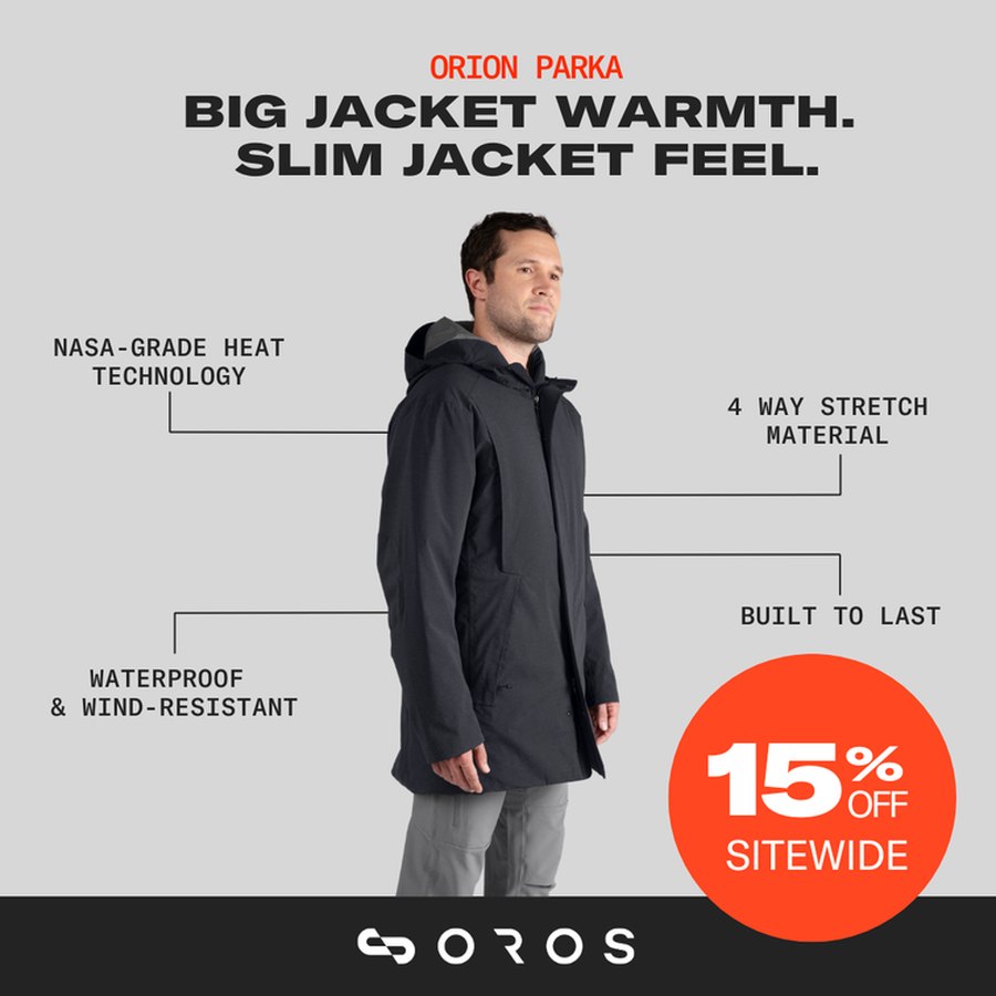
 Before
to see the after
The problem
The Premium Disconnect.
Nothing in the campaigns communicated the true value of the parka or justified its price point. With growth coming almost entirely from the existing email list, we had one winter to solve the problem.
The approach
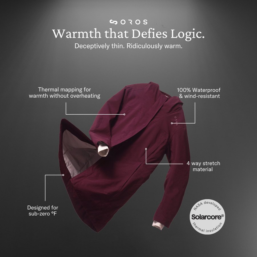
Show the technology instead of listing it.
Same claims, same product. What changed is the visual language. The NASA-grade technology and the premium the price implies are carried by the design now instead of a list of specs: serif headline in sentence case, the garment lit against a dark ground, and the discount burst replaced by the Solarcore® seal.
Built for Extremes. Designed for Everyday.
 Before
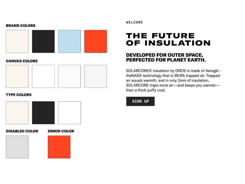
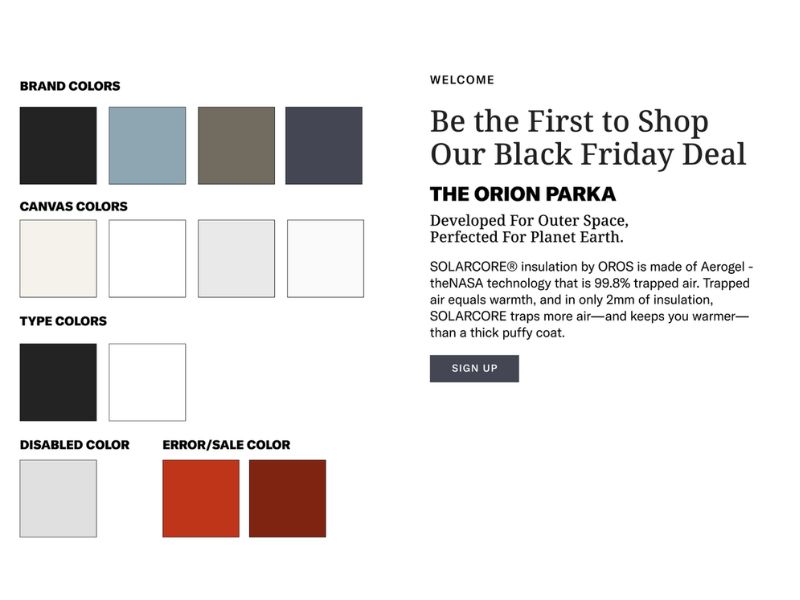
Brand system
Reads like a tech startup, not a fashion brand. The palette is narrow and light: signal orange, pale sky blue, and little in it that looks like a premium product.
Reads like a fashion brand now. Slate, taupe and deep navy give it the range it was missing, serif headlines and sentence case replace the bold caps, and the sale colour drops from fluorescent to oxidised brick. Enough weight to hold a premium price.
02 · Paid ads
 Before
Creative that stood out in a crowded market
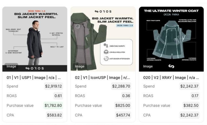
A refreshed visual system and messaging framework, paired with creators who fit the technical-but-approachable brand. It let the account scale into peak season.
The account
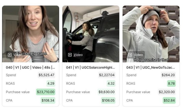
Most of what was running returned less than a dollar for every dollar spent, and a purchase was costing $432.
New creative on the new positioning. 42% less spend, two and a half times the purchases.
Blended ROAS
0.65→4.46
Cost per purchase
$432→$102
Ad spend
$14,262→$8,276
Purchases
33→81
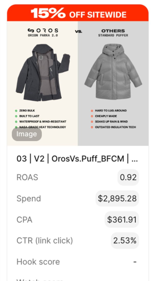
 Before
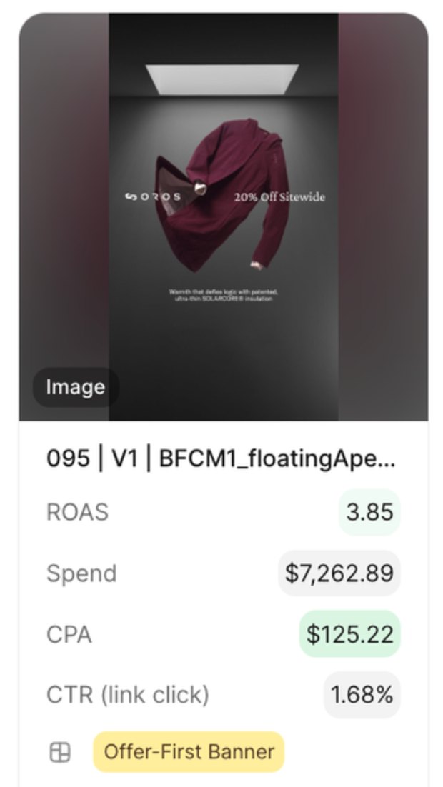
Standing out in the most expensive month of the year
The new ad absorbed two and a half times the spend at a third of the cost per purchase — on fewer clicks.
Black Friday · same slot, same week
I shot the product image in this ad.
One afternoon
Three of the top four ads were shot in a day by two people
The angle we most wanted to test needed timing you can't put in a brief, so a coworker and I shot them ourselves and cut three variations.
$35,660 from 3 ads · 4.45 ROAS · 8.78 best single ad
03 · Web design & CRO
A site that reflects the premium quality
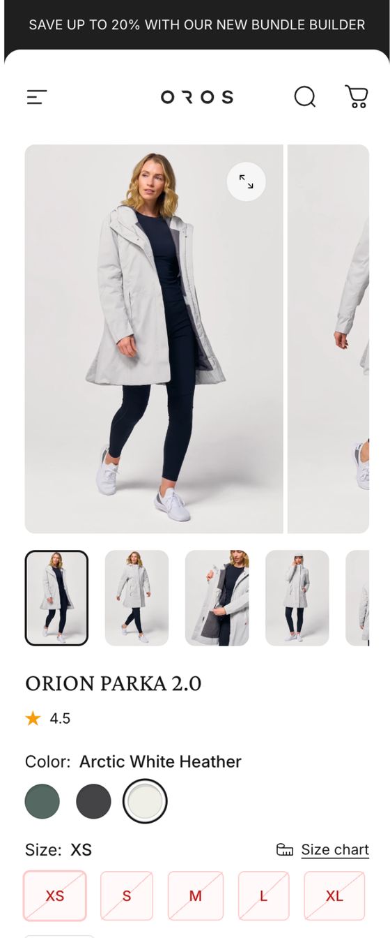
We implemented a new theme and completely rebuilt the PDP to intentionally highlight the product's technical credibility. As the catalog grew, we restructured the cross-selling strategy. Instead of leaving users to compare a dozen different jackets, the new flow guided them to build a complete outfit.
+38% conversion rate · +68% average order value
 Before
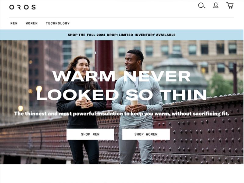
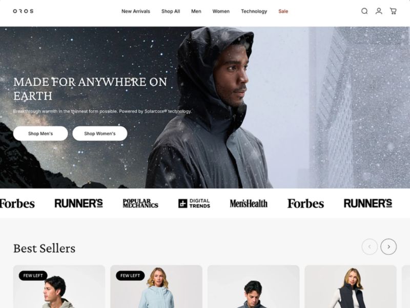
Homepage
A promo bar, two people with coffee, and no mention of Solarcore anywhere on the screen. You reach the fold without seeing a product.
A hero that looks like the technology and names it. Press logos directly underneath, then bestsellers, all in the first fold.
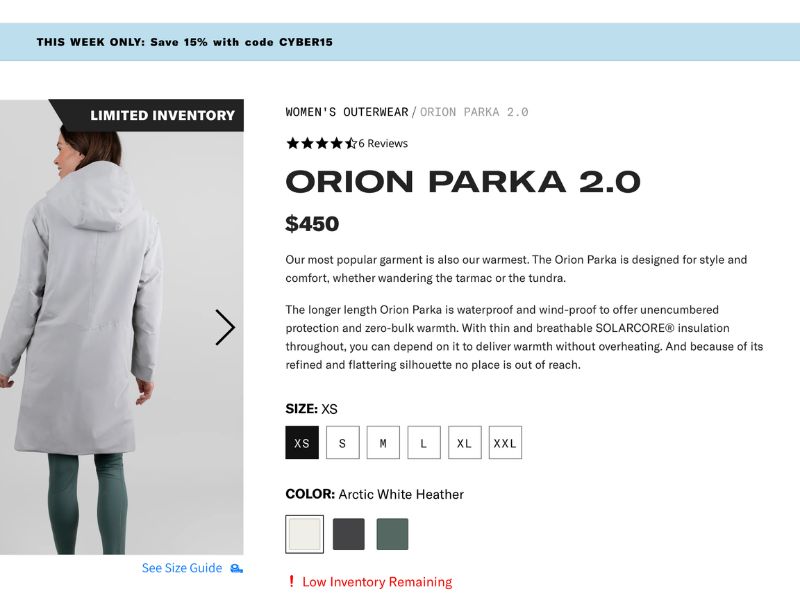
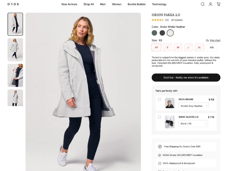
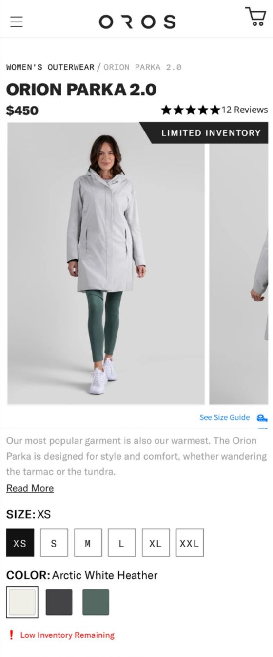
Product page — desktop and mobile
 Before
 Before
The rebuilt page names the technology before it names the price, and the cross-sell below builds an outfit instead of a shortlist of jackets.
04 · Photography
 Before
Performance is hard to photograph standing still
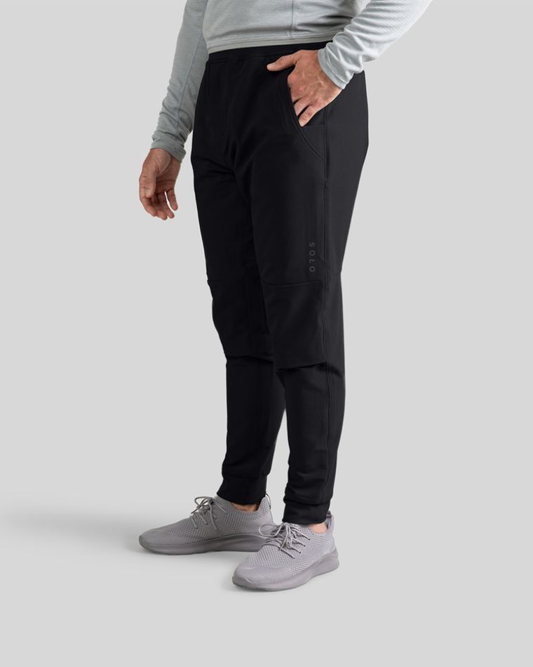
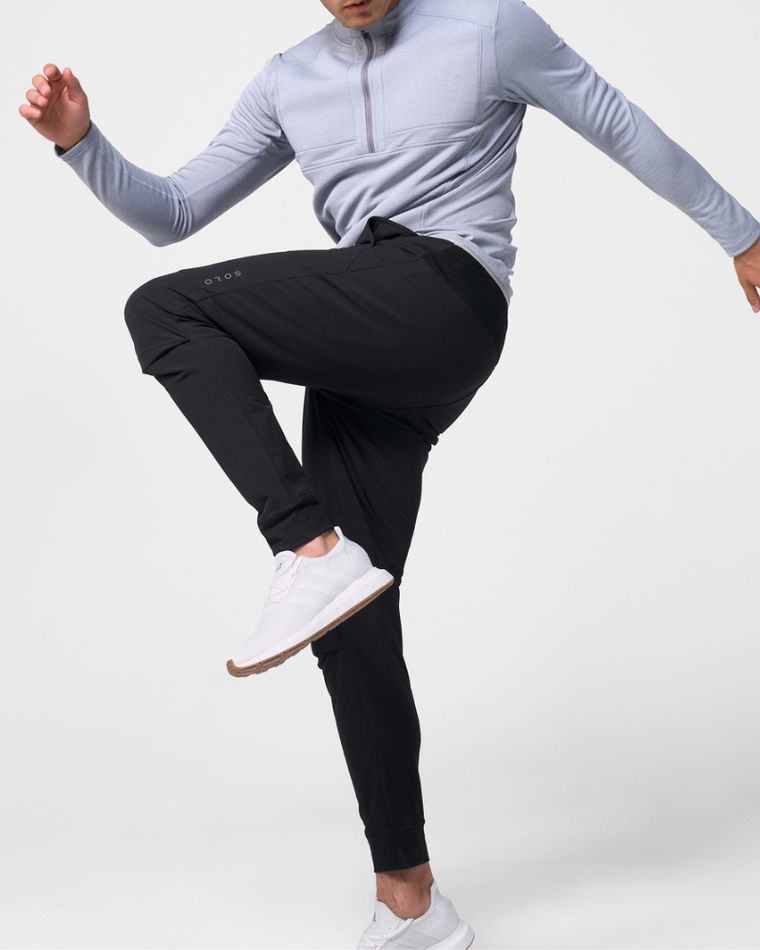
Standing still, a garment shows its shape and nothing else. None of the stretch, none of the unrestricted movement the product is built for. So the shoot was built around movement.
Product photography
Cropped at the waist, standing still, on flat grey. Nothing in it reads as premium, and nothing in it shows what the product does.
Full figure, mid-stride, a knee lifted. The movement shows the stretch and the range, and makes it look easy to wear on an ordinary day.
Let's chat
Looking to elevate your brand's digital presence? Let's talk about how we can bring your product's true value to life.
Get in Touch →Next case
A creative engine built to scale →casestudy 02:
A creative engine built to scale
What I was in charge of
- Performance creative
- Nearly every ad on the account, static and video
- Creative testing
- Sprint framework, angles drawn from customer language
- Creator direction
- Selection and briefs, with the influencer marketer
- Asset production
- Product photography and AI-generated imagery, from a limited library
- Amazon creative
- Listing images and A+ content, with the team
What the year added up to
Sales growth, year over year
+236%
Amazon sales, first 6 months
$546K
A channel that did not exist the year before. #7 in its category.
ROAS (MER), year over year
+39%
Agency account numbers — my scope is listed above.
The brief
Past early traction, and slowing
Milky had set up its growth engine in 2024. By 2025 the easy audiences had been bought, tariffs were squeezing margins, and there was pressure to show the growth could scale without losing efficiency. No rebrand was coming and no new site. The job was to evolve the engine that already existed.
01 · Performance creative
Better ads, lower acquisition cost
Disciplined sprints across creators, formats, angles and hooks. Every test was grounded in real customer language — reviews, support threads, the words people used describing the product to someone else — so each round started from what the last one had learned rather than from a blank page.
What the creative moved
Customer acquisition cost
−16%
New customer ROAS
+13%
Product subscriptions, year over year
+146%
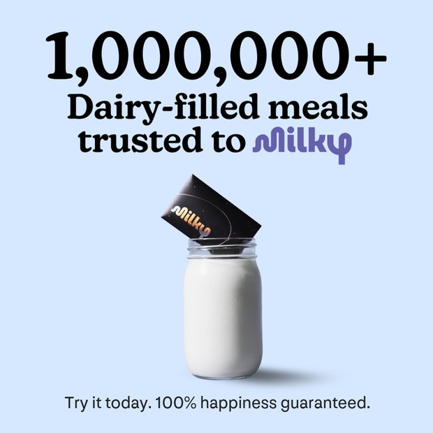
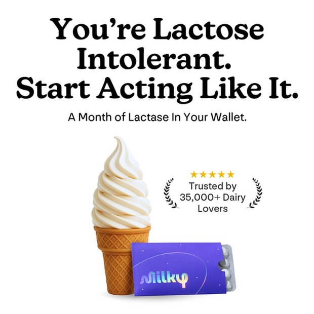
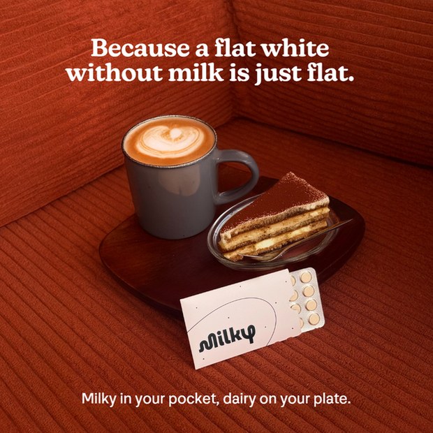
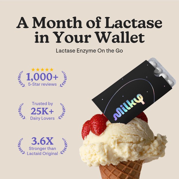
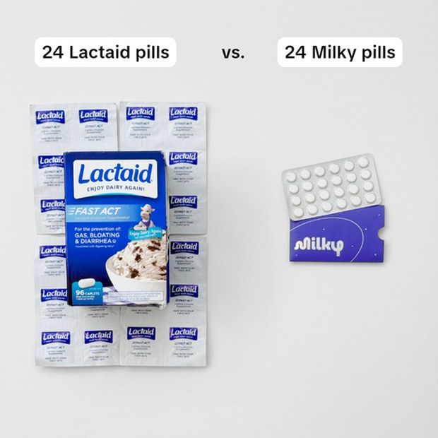
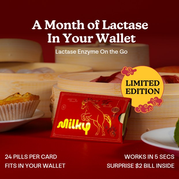
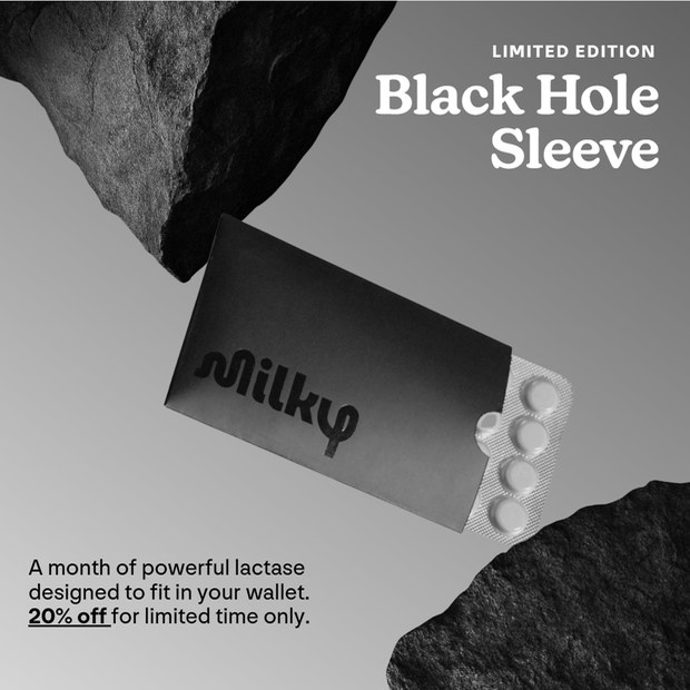
Seven of several hundred. Social proof, provocation, a side-by-side against the category leader, two limited editions — a different reason to buy in each one.
Creator cuts. The influencer marketer brought the partnerships; I chose who fitted the argument being tested and wrote what they needed to make, then cut the raw footage. Most of the b-roll in these is mine.
Making the assets
Almost none of this existed before we made it
Milky came with a limited photo library and almost no video. I shot a lot of the product myself and generated the rest with AI tools, then built everything into the brand’s system. Testing at that pace meant producing the raw material as well as the ads.
02 · Amazon
A channel the brand had not opened yet
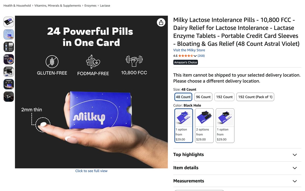
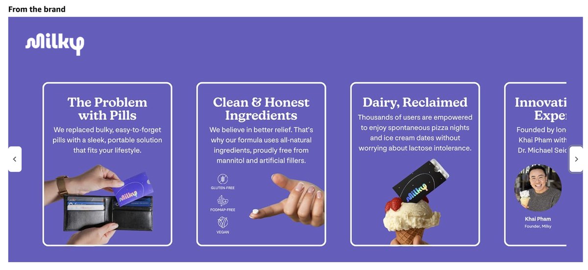
The team built the case for Amazon against an initially hesitant C-suite and led the launch. I made the listing images and the A+ content with them, using what a year of ad testing had already established about which arguments landed.
Sales, first six months
$546K
Category rank
#7
How the year ended
Tariffs squeezed margins halfway through, and the ROAS targets tightened.
We took the retention data back to the client and made the case to keep investing: repeat purchase was holding and product subscriptions were up 146% year over year. The budget stayed — which meant every ad I made after that had to clear a higher bar than the one before it. That is the half of the year I learned the most from.
Let's chat
Looking to elevate your brand's digital presence? Let's talk about how we can bring your product's true value to life.
Get in Touch →Previous case
Rebranding that led to 290% YoY sales growth →